Using Data to Improve Performance: Five Common Errors

Five Common Errors
Every company that analyzes root causes should collect and use root cause data to enhance its performance efforts. However, when I review companies’ data analysis and use of root cause statistics, I often find that instead of using their data wisely, they misuse data and draw the wrong conclusions. So, how are you using your data? Do you have any of these five common errors when using root cause data?
- Combining data to look for overall trends.
- Improper use of graphs.
- Chasing trends that aren’t trends.
- Trending root cause data based on poor root cause analysis.
- Not using data “locally.”
Let’s look at each of these problems, explain them in more detail, and describe how to fix each problem.
1. Combining data to look for overall trends.
Analysts often complain that they don’t have enough data to look for a trend. Accidents and incidents are too infrequent at one plant/facility/unit, so there are to few data points to “trend.”
What do they do? They combine the data from several facilities, plants, or units until they have at least several accidents/incidents per month. Then, they can show management a bar chart of the data from each month and look for “trends” (things getting worse or better).
For example, one might make a bar chart of the number of incidents across a corporation. In this case, let’s look at the number of incidents across an oil company, including exploration, production, refining, and chemical facilities. Their bar chart might look like the following…

By looking at the chart, management might decide that:
- The first five months of the first year was a negative trend.
- Improvement efforts implemented in May caused a major improvement.
- In the second year, October was a particularly bad month, much worse than the previous October.
What’s wrong with this analysis?
First, month by month changes may not indicate a trend. It could just be bad luck that several different business units had a slightly higher incident rate in a particular month (like May and October). Therefore, some would recommend using a six-month moving average graph (shown below) to dampen out the month by month variation.

This type of graph muddies the water even more. First, the summing of data across different business units muddies the picture. The production, exploration, refining, and chemical business units have different management and face different challenges. A “bad” month (like May or October) may be caused by each unit having a slightly worse month, but when they are all summed together, it looks like a trend. Then, averaging six months to get a “moving average” muddies the water more.
What do we do to solve this problem of combining data? Don’t combine data! The more “local” the data is, the more likely trends will indicate actual performance. So, instead of combining exploration, production, refining, and chemicals, they could analyze their data by looking at individual business units and perhaps even individual plants or rigs.
However, the data may be sparse when looking at individual business units or plants. Two particular types of charts—the interval process behavior chart and the instantaneous rate process behavior chart—can help one understand trends in sparse data. These charts are explained in Book 8, Performance Measures and Trending for Safety, Quality, and Business Management.

What does a process behavior chart look like? The graph below explains the basics…

Below is a rate process behavior chart that shows performance getting worse (the instantaneous rate of incidents is getting worse).

This chart was taken from a previous article, How Do You Measure Significant Injury and Fatality Improvement?
2. Improper use of graphs.
The example above is just one type of improper use of graphs. What are other examples? Pie Charts are often missed (and aren’t very good even if used correctly).

Take the simple chart above. What does it mean? We can see that the Exploration Division had the highest percentage of incidents, but that’s where the questions start. Over what time period? What was the relative size of each business unit (how many person-hours for each unit over that period of time)? Are the percentages changing over time? How do we compare these to industry performance?
There is an excellent book about the misuse of statistics and graphs…

Click on the book above to order it on Amazon.
Even if you use a chart that is usually well-understood and helpful (for example, a Pareto Chart), it can still be misused. For example, you might make a Pareto Chart of incidents in the past year at various refinery units. You might do this by counting the incidents at each refinery unit/department, as shown below…

This seems to indicate that you should focus your limited improvement efforts on eliminating incidents in the Blending and Shipping Department. After all, the Blending and Shipping Department accounts for 44% of the refinery’s incidents.
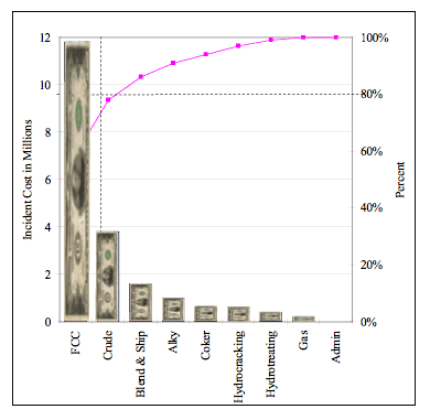
But what if you were interested in cutting costs? You should probably scale the incidents by the total cost of the incidents for each department/unit. It might show a completely different result…

In this case, the FCC unit had the highest cost incidents in the past 12 months. About 70% of the total incident cost.
But what if you were concerned about safety? You would need to scale the Pareto Chart by a measure of the significance of injuries/fatalities.
Thus, even when using a well-understood, helpful graph, you must be careful in choosing the data and how it is shown.
3. Chasing trends that aren’t trends.

Yup, that sure looks like a trend. But what if it isn’t? For example, the data points below seem to indicate a trend…

Management often makes a straight-line projection and demands action to reduce this adverse trends.
They might have a knee-jerk reaction and decide to:
- Fire the safety manager.
- Have a safety stand-down and show employees a video of senior management emphasizing the importance of safe behaviors and having a questioning attitude. Remember, safety is a condition of employment!
- Contract with a consultant to develop a new safety program.
But what if we had a longer-term view?

Look at the data points above. Do you see a similar pattern?
All processes have variation. The process above produces somewhere between 12.5 and zero incidents per month. Thus, even 12 incidents in a single month isn’t a trend. It is part of this process’s variation.
So, what is the knee-jerk reaction do? People will probably report fewer incidents. Less precursor incidents being reported, investigated, and fixed means less learning and perhaps an even bigger incident in the future.
But what if management doesn’t like 12 incidents in a month? Can they just change the upper limit and say that it should be an 8 for the upper limit? No. The limits are set by analyzing the process output. If management dislikes the output, they need to change the process, not just the limits.
To fix the problems in the examples above, one must have a plan for what to trend and how to trend it, including what graphs to use and how to use advanced trending techniques (Pareto Charts and Process Behavior Charts).
4. Trending root cause data based on poor root cause analysis.

Garbage in = Garbage out.
If you aren’t finding root causes or if you only find a fraction of the root causes, your root cause data won’t show a true picture, no matter how good you are at statistics or trending.
So, before worrying about trending, you should ensure that your root cause analysis system is accurate and consistent.
What do we suggest for accurate, consistent root cause analysis? TapRooT® Root Cause Analysis, of course. And why does TapRooT® Root Cause Analysis work so well? The design of the TapRooT® System. Read more about the design HERE and HERE.
Even those using TapRooT® RCA know that they need to continuously improve their root cause analysis efforts. That’s why they grade their investigations and attend the Global TapRooT® Summit.
5. Not using data “locally.”
Sure, top-level management and corporate staff want to know if performance is improving or declining. However, the people who make performance happen, the people at the pointy end of the stick, really need to know how they are influencing performance. That’s why trending should start locally.
What kind of trends should be kept locally? Certainly, there are reactive trends like:
- Significant injuries and fatalities
- Lost time injury rates
- Scrap and rework percent or cost
- Cycle times
- Setup times
- Production rate
- Schedule slips/late shipments
- Customer quality complaints
- Unscheduled equipment outages
But there should also be proactive measures that are trended:
- Pre-job hazard assessments completed
- Pre-job briefs conducted
- Hazards eliminated or guarded against
- Corrective actions implemented
- Maintenance backlog
- Training hours and percentage of workers attending
- Field audits or peer assessments
All this data should be trended locally. Every production unit should know its trends and have plans to improve them.
Are you promoting local trending by workgroups or supervisors?
Time to Take Action
Did you get ideas about improvement from the discussions above? Then perhaps you should be:
- Improving your trending techniques
- Make a plan for what needs to be trended and how the statistics should be presented
- Learn to use or improve your use of advanced root cause analysis
- Get trending started on the shop floor
For more training about advanced trending, consider attending 2-Day Measurement, Trending, and Predictive Analytics pre-Summit Course on September 29-30 in Knoxville, Tennessee.
To learn more about advanced root cause analysis, register for one of our upcoming TapRooT® Courses.
And to improve your use of root cause analysis, register for the upcoming Global TapRooT® Summit and a pre-Summit Course.


