What do you Pareto by?

Do you use Pareto Charts to target your improvement efforts? You should.
But what data do you use to draw your Pareto Charts?
Counts of things are a good start. But scaling the chart by cost may be even better.
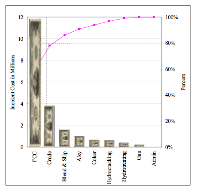
The chart above is a chart of accident cost in dollars by unit at a refinery.
If you just looked at the counts of incidents, Blending & Shipping was far ahead of all the other divisions. But the cost of the Blending & Shipping incidents was small.
However, the FCC Unit incidents were few in number but very costly. Therefore, we scaled the bars on the Pareto Chart by cost. The FCC Unit is the obvious place to focus your efforts … if you are trying to reduce the cost of incidents.
Want to learn more about advanced trending techniques? Attend the upcoming Measurement, Trending, and Predictive Analytics: How the Best Use Data to Improve Work Training being held at the Margaritaville Lake Resort, Lake Conroe, near Houston, Texas, on April 24-25. This course is being held just prior to the 2023 Global TapRooT® Summit. Get complete Summit info here:
http://www.taproot.com/summit/
Register for the cause only by CLICKING HERE.
Register for the Course and the Summit by CLICKING HERE.


