Who drew the first Pareto Chart?
Did Vilfredo Pareto draw the first Pareto Chart?
Joseph Juran (quality expert) pictured below…

named the Pareto Chart after Vilfredo Pareto (pictured below).
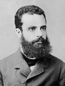
Who was Vilfredo? An economist, sociologist, and engineer born in 1848. He calculated that 80 percent of the land (or wealth) in Italy was held by 20% of the population. However, Vilfredo never drew a Pareto Chart.

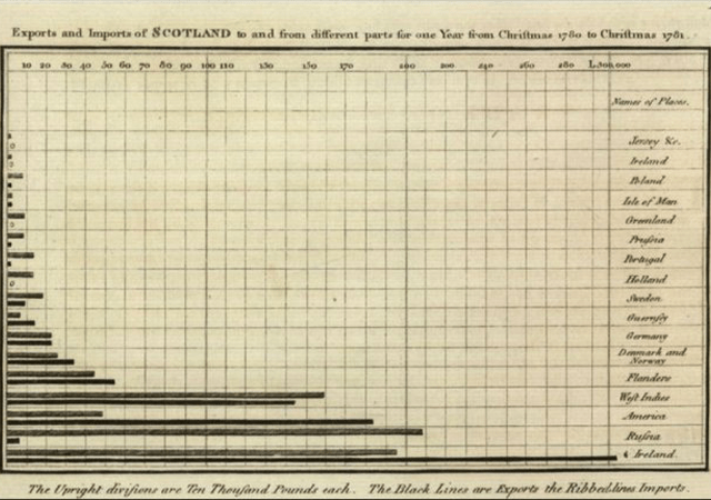
When was the first Pareto Chart drawn? I would suggest that graphics expert William Playfair (pictured above) drew the first approximation of a Pareto Chart (or bar chart) soon after 1781. BEFORE Vilfredo Pareto was even born! The chart is shown above.
What do you think? Does the graph of imports and exports to Scotland look like a Pareto Chart? Maybe we should call them the Playfair Charts?
Do you know the secrets of applying Pareto Charts to improve performance? You can learn to use them effectively at the Measurement, Trending, and Predictive Analytics: How the Best Use Data to Improve Work Training on April 22-25 being held at the Margaritaville Lake Resort, Lake Conroe, near Houston, Texas. The course is being held just prior to the 2023 Global TapRooT® Summit.
Attend the course and learn to:
- Use incident and root cause analysis data
- Know if a trend is significant
- Efficiently display a trends
- Make your data really reliable
- Spot where you need to improve
- Trend infrequently occurring data
- Present data to management to help them manage performance
Don’t miss out! This course is only offered once each year.
To register for the course only, CLICK HERE.
To register for the course and the Summit, CLICK HERE


Agreed with the Article, Pareto analysis is required to find out the root cause. Pareto chart should be presented to find out the root cause.